Custom Control

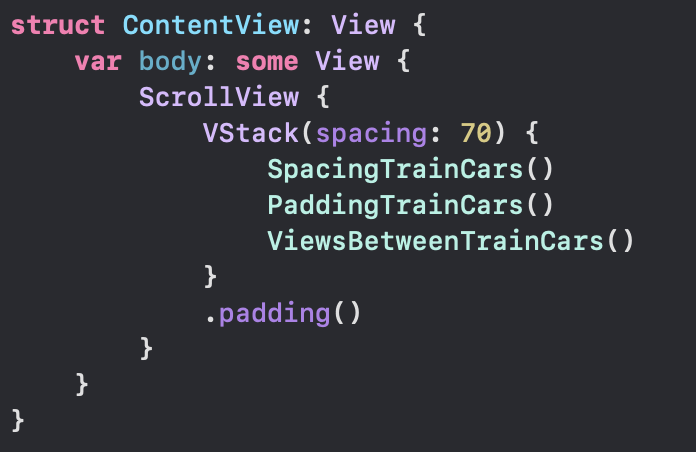
This lesson takes the same demo used in the previous lesson to illustrate input controls & @Binding

I opened up the app to toy with those stars, start giving the recipes new approval metrics…
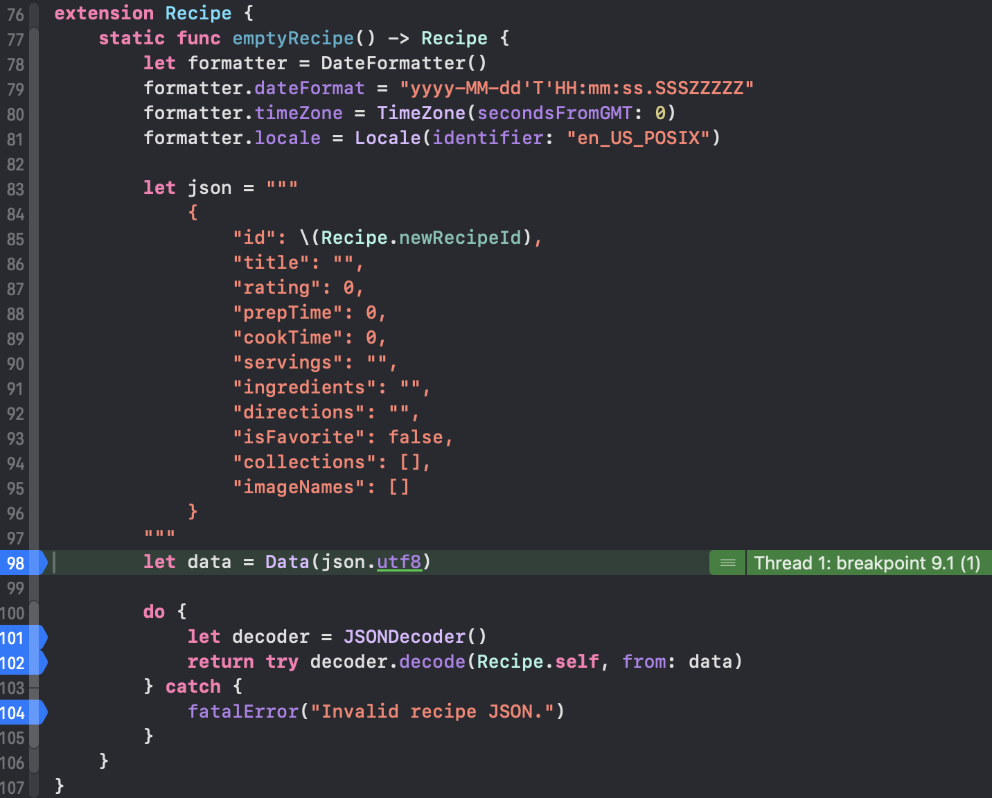
Some breakpoints I had forgotten about were active on the Recipe struct. Each time I updated the recipe, the actual Recipe struct would update also from inside the emptyRecipe extension?? 🤔
Why is this extension function for new recipes firing given we are updating an existing recipe?

The other weird thing, while I had breakpoints activated inside DetailView, to try and learn why the emptyRecipe extension was fired and run through memory.
If you have breakpoints placed inside Recipe extension static func emptyRecipe, when running the app you will discover this function is fired first, before any method that called this function. I don’t like that. I don’t want to get sucked into a rabbit hole so let me try to display quickly.

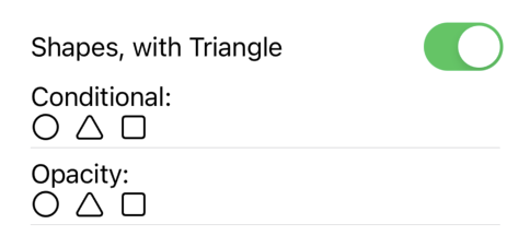
They have Experiments where they suggest we change the SFSymbol Image, or change the foregroundColor. Do it! Make it whatever you want- triangle & green if you are still stumped after taking Apple’s suggestion.

Looking at Section 2, they mention the tap gesture that drives action for the star/circle/triangle to get a fill or not. I could envision how the system may want to update & save when a user interacts with this view. It is not a best practice, meaning the system is making a few unnecessary operations which may now or in the future impact performance in the app an on the device. Does that make sense?

We have Section 3, which attempts to tie things together. I tapped around the View, it would fire my breakpoints on emptyRecipe, I’d say what the hell? It works, but this other function is distracting. Turn off breakpoints there for now– so my breakpoints are off on Recipe.swift- but they still kind of went crazy in DetailView.swift. They seemed to repeat 8 times when I clicked in and then StarRating had breakpoints that fired 8 or 11 times, back to DetailView another 12 ish times and finally the render came through.

Updating the recipe at that point seemed to refresh all the ratings for reach recipe. The weird point is, the recipeID stayed the same:

So what is happening under the hood? I have no idea now- this tutorial challenged my comfort with SwiftUI. It feels as though they tried to make an amazing cake, put too much stuff in and now it’s not so great. I want to hurry up, wrap the final lesson and have my retro where I can explain between tutorial 1 and tutorial 2, I think you, whoever is in Internetland reading, knows where my feelings about this are. Maybe if I ignored the breakpoints things would have been fine, but I feel as though once you see some activity is wrong and should not occur, it would also be wrong to not call it out. Maybe I am misinformed about SwiftUI in this demo- but I hope someone can send me a message and tell me what I am doing wrong.

Standard

State and Binding part 2

Picking up where we left off, I will wrap my ideas on @State & @Binding presented here.

Looking at ContentListView, I am kinda sorta grasping this a little better- follow me as I try to lead us to the 💡

In ContentListView, our @State property is recipeEditorConfig. We have the required default setting of us creating the object. Let’s take a look at this file, RecipeEditorConfig.

It is a ViewModel- or this struct is meant to help us organize our actions meant to happen in the view.
I guess reading this the first time, it all went over my head 🫨. Now, after the Nth try, the idea of @State is getting clearer. In Section 1 they start discussing RecipeEditorConfig but I like to look at where it is being accessed from first- it helps me understand the context a bit better. So on that other level, ContentListView, recipeEditorConfig is used for the Button behavior, also to present the sheet, and it is passed to the RecipeEditor. Below this, we have a private function that also uses recipeEditorConfig to determine ‘save this?’ with a conditional that helps us determine if the recipe is new, or just an update. Okay so what? @State manages “down flow” where the information is there, and the data flows down to the subviews. Click into RecipeEditor, and we can right away notice recipeEditorConfig has a different attribute- now this is a @Binding. What makes this important? The property config is the instance of RecipeEditorConfig, and its strength changes because now config cancels the action or confirms it as done. The result of this action changes everything, makes the whole view go away. Also @State has to have a default value and should be private. @Binding, from the example of this tutorial, should not be private. The information we receive needs to be injected from somewhere, and the information we deal with here, could blow everything up- feels like we are dealing with firecrackers more here

Exploding Clay Minion

I guess I caught up to where they describe it in Section 2 🏃‍♂️‍➡️
Section 3 is where they caught up to me 😂 They discuss ContentListView, I couldn’t make sense of it- it made me want to look at the code for inspiration.
Maybe after reading it, it started to make sense in reverse, but I’m glad I took time to try and break it down. Hopefully some of y’all do as well.

Standard

State & Binding part 1

Recipe editor is the app shared to demonstrate how to use @State and @Binding

This project they share is fluffy for a Recipe Editor. It has recipes which are stored in JSON, an option to ‘favorite’ a recipe and a way to add new recipes. Regrettably, new recipes are not saved nor are favorites persisted. If I favorite a different recipe or add a new one, once I turn the app off it will all be gone, with the app in this form.

There are a few property wrappers we should understand from this lesson:
State & Binding I mentioned above, we also have @StateObject, @EnvironmentObject, @ObservedObject. There is a class they created that manages Images. It was awkward where they mention the solution is a hack which should not be used in real life. The other class is the RecipeBox, which is an ObservedObject.

I need to take a moment and just say it- this lesson had me confused most of the time, like what is the best use of @State? I prefer how they presented it here. The intro was more gentle, clear and with a purpose. Anyhow, I wanted to take a step back and explain the relationship of @State and @Binding:
You have a view, which has properties. These properties impact the way our view looks with regard to a switch, some color or text, whatever. Let’s say that one of our subviews would display different content based on one of our properties’ result. The first line in the docs states : Use state as the single source of truth for a given value type that you store in a view hierarchy. So here we have this important piece of information, the PlayButton.isPlaying (as in the docs), we will showFavoritesOnly (as in the first tutorial), and in this tutorial we will configure the Recipe Editor, show delete confirmation on the View level, and on the App level we select a Sidebar Item & select a Recipe ID. I guess I didn’t have that 💡 moment over the past week reading the code, running breakpoints, and I’m sort of fuzzy on if @Binding is too heavy of a ‘hammer’ for the same task.

Docs on @State have a comment regarding @Binding: If you pass a state property to a subview, SwiftUI updates the subview any time the value changes in the container view, but the subview can’t modify the value. To enable the subview to modify the state’s stored value, pass a Binding instead. Okay, that seems clear. reading further, Like you do for a StateObject, declare State as private to prevent setting it in a memberwise initializer, which can conflict with the storage management that SwiftUI provides. Unlike a state object, always initialize state by providing a default value in the state’s declaration, as in the above examples. Use state only for storage that’s local to a view and its subviews. A whazza? @StateObject we have in our sample app, fuzzy on how it relates but here we are!

Pivoting back to the app, looking at RecipeBox it behaves as our data fetcher. Inside RecipeBox, we can see it manages the recipes and there is a method to pull data from JSON. It makes me curious: if we want to write to JSON in our RecipeBox, would this remain a @StateObject 🤔

Standard

S p a c i n g

This lesson helped tie things together for me. Start by downloading the app right away, check out ContentView & TrainCar files. We have a VStack embedded in a ScrollView, spacing on the VStack is 70.
We can observe three embedded views, SpacingTrainCars, PaddingTrainCars, & ViewsBetweenTrainCars. Below in the project navigator we see folders for Spacing, Padding and Adding Views.

Immediately I jumped down to the Spacing folder and started looking at all the files. It was fun changing values and seeing the result right away, changing the Dynamic Type & trying all over again.

It seems this lesson brought out the boy in me 👦🏾
At first I did not like the pre-made lesson, now its growing on me

I went through the views, adding a background and saw they don’t layer the way I would figure they should. Let me give an example:

I colored backgrounds here at the top. Scaled Spacing has different shades of gray. Zero Spacing has the 🇮🇹. So what?
I drilled down to TrainCar & gave it a background too. The Image inside the body of TrainCar was given a background of .systemGreen.
Looking at all of them, I saw they were all made .systemGreen.

Removing the .systemGreen background modifier at the base level allowed all the colors above to propagate down and display. I feel like there is more I could learn about this lesson, but I want to keep publishing for y’all and wrap this up!

Standard

Content with Stacks

Downloading the sample app, I went to Dynamic Type immediately to check how it handled AX5.
I am curious. If Design wished to have some text in the ribbon above, and that text changes size, how would we also get the ribbon to change size with it? Obviously we could not keep the stripeHeight at a constant 15, maybe this is something I missed, hopefully an answer will appear in my mind overnight 😅🌝

Let’s say the text in red was to scale up with the dark ribbon at the top of our tile. Would it spill out of the ribbon? Could the ribbon grow to accommodate the text, while satisfying the ratio on the bottom half?
I want to review an earlier project in this series. For now, I want to solve this.

Thinking about it, I wanted to stop and implement text in the top. How would I got about this?

Starting with the following, what is provided in the bottom of EventTile:

.background {
    ZStack(alignment: .top) {
        Rectangle()
            .opacity(0.3)
        Rectangle()
            .frame(maxHeight: stripeHeight)
    }
    .foregroundColor(.teal)


I started tinkering on the top Rectangle. I forgot that we are stacking our views and each next view typed underneath is layered over this view. My first ZStack was focused around the top rect, then I said what the hey? tinker with the bottom one. And after I did…

//Suddenly it clicked and it's like- okay. 
.background {
    ZStack(alignment: .top) {
        
        Rectangle()     // this is the bright pretty teal ON BOTTOM
            .opacity(0.3)
        
        ZStack {
            Rectangle() // this is the bar ON TOP 🤦‍♂️
                .frame(maxHeight: stripeHeight)
            Text("My life")
        }
        
    }
    .foregroundColor(.teal)

I’m kind of mad it took me this long to figure it out 😅
But I’m glad I made it past the lump. I guess I got my answer so far- No the banner does Not increase in size to accommodate the text. At least not this way 👨‍🍳

Updating the top property stripeHeight to have @ScaledMetric attribute did help here. So there’s that- I remember we used that in the other lesson to allow the Capsule to gain in size.

But some of you know the problem here. Design is off.

The text should be inside the ribbon

To remedy this, I increased the stripeHeight- but this is one of those problems where I feel like the product team or designer would slam me for changing that 😅 Which is fair- if we don’t have the text there everything would appear different as a result. So I want to put this idea on the shelf- how to keep the same stripeHeight & shrink the font to something manageable.

Took some time away and came back, feeling like I had a solution to the problem.

@ScaledMetric(relativeTo: .subheadline) var stripeHeight = 18.0
var body: some View {
    ...
.background {
     ZStack(alignment: .top) {
     Rectangle()     // this is the bright pretty teal
                .opacity(0.3)
     ZStack {
                Rectangle()
                Text("Big Time Alert")
                    .foregroundStyle(.red)
                    .font(.subheadline)
     }
     .frame(maxHeight: stripeHeight)
}
.foregroundColor(.teal)

So- what’s going on?
I changed the Text(“Big Time Alert”) font to accommodate the ScaledMetric dynamic property, and I set that font to .subheadline so the actual size fits design and we can fit our text into the Rectangle better.

Standard

Peek-a-boo

Choosing the right way to hide a view was short & sweet. Essentially, there are two objectives when hiding a view. Hide and save the space, or hide and pretend like it was never there. We can use .opacity(_:) and VoiceOver will respect that we don’t want a zero-opacity view to be ‘voiced’, yet the space will remain. If we want to close the space, we can use a Conditional (if) statement.

Apple uses a train example, I’m using shapes.
We use a boolean @State var to control both Conditional & Opacity lines.

// Conditional
if moreShapes {
    Image(systemName: "triangle"
}

// Opacity
Image(systemName: "triangle")
    .opacity(moreShapes ? 0 : 1)

to recap, if we want to hide a view, and pretend like it was never there, use a Conditional approach

if we want to save the space, use Opacity

Standard

Overlay

Layering Content

While there is much to be gained from this lesson, I feel like it would have been nicer if, again, they had followed the paradigm from Landscapes. It is nice to read code, but if that is the point, why go through the trouble of making an Xcode project & scrollable sliding detail? It looks fabulous but at the end this lesson is in fact a walkthrough.

This was interesting, though:

Could the same code entered in a different approach on separate machines render something different?
Does this question make sense?

Choosing the right way to hide a view felt like a sticky pad with the text .opacity( 🙂 ✅

I want to take a moment and shout out another dev, Diego Lavalle for the article https://swiftui.diegolavalle.com/posts/linewrapping-stacks/. I had an issue which I was trying to grapple and this post gives me ideas on how to solve it.

Scaling Views to Complement Text I spent a lot of time reflecting on. Why? I was working on a problem around Accessibility and edge cases. On my ExitRowUI the circles would remain the same size as the Dynamic Type got larger, then if there are several trains at a particular station (Times Sq, Atlantic Av), the text inside would be clipped. The user would not be able to tell what they are seeing: it was just a circle with clipped text inside. This led me to tinkering with Label and reverting back to Text after noticing the content was no longer centered when I changed to Label. I did some digging and just like Diego made me imagine a solution to this problem on my ExitRow, I found a snippet from Apple in LazyHStack documentation that solved the problem in a different way.

Standard

Retrospective & Scaling Views

Last post, I wanted to share how I’d start about helping new Swift developers understand how to use HStack, VStack, ZStack & a modifier .onAppear. In addition, I introduced the idea of running a Task and hitting a URL and returning some information to the console.

It was too much! I did not have a formal plan and as a result I wanted to explain too many things, the post was getting too long and it was not interesting anymore. This was my fault and I’m sorry readers. Many things going on here, and it is challenging staying focused and consistent. I’m here to review SwiftUI Concepts Tutorials. Once I am done maybe then I will create my own version of the tutorial. For now, let’s move forward.

Starting this lesson, I gained heaps 💡

They introduce the idea of KeywordBubbleDefaultPadding. Okay so what?

It goes back to the idea we started a few days ago. We parsed a CSV file that had locations for subway exits, and in the end we were able to parse and display a list of stations. What if we had a chance to prettify this and make the style of the letters what you would see from the MTA themselves?

I made some modifications here after reading this lesson. Originally, I had made it a ZStack with a Circle typed above Text. The sizes were independent of each other, so I like now I use .padding to let the system center the line designation.

Moving on the lesson highlighted the idea of ‘Dynamic Type’. This is for users who may want the font on their phone to be larger than standard- I was able to see the .frame(width: modifier I set was negatively impacting the size. Design would have my head! 😭 Removing that made my Circle increase with Dynamic Type. Again, the lesson helps me feel the gains 🏋️‍♂️

Standard

How I’d do this

Some of you may wonder why I bothered to criticize 🍎 after all they contributed. Could I show the relationship between an App, Scene & View better? I don’t know. But I can try. Let’s begin:

I had a quick fumble after believing I saw something wild, such as:

import SwiftUI

@main
struct SceneStartApp: App {
    var body: some Scene {
        WindowGroup {
            Text("Hello World")
        }
    }
}

which if you yourself try this will learn that this does not work 😅

Let’s conclude there are no ‘bounds’ for this Text View to be in. Since we cannot define where on the device to show our Text view, the app will crash.

Let us add bounds in our SceneStartApp, and change our Text into a Circle().

import SwiftUI

@main
struct SceneStartApp: App {
    var body: some Scene {
        WindowGroup {
            HStack {
                Circle()
                Circle()
                Circle()
            }
        }
    }
}

Changing the HStack also gave me new alignments, below are VStack & ZStack respectively.

The code for my circles never changed. The ZStack aligns our three circles on top so the user always looks down on them- or the orientation would be deep “inside” the phone, like marbles in the pocket.

One thing we are missing when we do this, is the preview window. I had to run the app 3 times to view what was created, which is not ideal. Let us now remove the three Circle() lines, put ‘ContentView()’ back and add below that line:

        ContentView()
            .onAppear(perform: {
                Task {
                    let urlString = "https://www.apple.com"
                    guard let url = URL(string: urlString) else { return }
                    let urlRequest = URLRequest(url: url)
                    let (data, response) = try await URLSession.shared.data(for: urlRequest)
                    print(data)
                    print(response)
                }
            })

The line right after ‘ContentView()’ is called a modifier, the contents of which will be run when our ContentView() is ready to appear. Inside the modifier, we create a Task, and inside of this we are creating a url String. We are going to take the String and make it into a URL object. The URL object next becomes a URL Request object. The URLRequest object is then passed to URLSession so we can receive the contents of that request. Finally, our data which is returned can be printed, and the response can be printed further below. The results of the print statements show up when we run the project:

189053 bytes
<NSHTTPURLResponse: 0x600000235300> { URL: https://www.apple.com/ } { Status Code: 200, Headers {
    "Cache-Control" =     (
        "max-age=0"
    );
    "Content-Encoding" =     (
        gzip
    );
    "Content-Length" =     (
        40058
    );
    "Content-Type" =     (
        "text/html; charset=utf-8"
    );
    Date =     (
        "Fri, 08 Nov 2024 20:20:38 GMT"
    );
    Expires =     (
        "Fri, 08 Nov 2024 20:20:38 GMT"
    );
    Server =     (
        Apple
    );
    "Set-Cookie" =     (
        "geo=US; path=/; domain=.apple.com"
    );
    "Strict-Transport-Security" =     (
        "max-age=31536000; includeSubdomains; preload"
    );
    Vary =     (
        "Accept-Encoding"
    );
    "content-security-policy" =     (
        "default-src 'self' blob: data: *.akamaized.net *.apple.com *.apple-mapkit.com *.cdn-apple.com *.organicfruitapps.com; child-src blob: mailto: embed.music.apple.com embed.podcasts.apple.com https://recyclingprogram.apple.com swdlp.apple.com www.apple.com www.instagram.com platform.twitter.com www.youtube-nocookie.com; img-src 'unsafe-inline' blob: data: *.apple.com *.apple-mapkit.com *.cdn-apple.com *.mzstatic.com; script-src 'unsafe-inline' 'unsafe-eval' blob: *.apple.com *.apple-mapkit.com www.instagram.com platform.twitter.com; style-src 'unsafe-inline' *.apple.com"
    );
    "referrer-policy" =     (
        "no-referrer-when-downgrade"
    );
    "x-cache" =     (
        "TCP_MEM_HIT from a23-196-2-157.deploy.akamaitechnologies.com (AkamaiGHost/11.7.0.1-2fb65fbfa7ad4f98bbb706cf20e2b5f6) (-)"
    );
    "x-content-type-options" =     (
        nosniff
    );
    "x-frame-options" =     (
        SAMEORIGIN
    );
    "x-xss-protection" =     (
        "1; mode=block"
    );
} }

All this happens when we are loading our ContentView, the system will make our Task go and hit apple.com, and return some information.

Standard

Concepts Tutorials

Exploring the Structure of a SwiftUI App

Today I started the next lesson from 🍎
It was a much softer launch than Landmarks. There, we are instructed to create a new app right away & start experimenting. Here in Section 1, we given some reading on the App, Scene & View protocols, further down we are directed to the Import Declaration & the @main attribute.

One thing I am curious about- are there other App attributes we should know aside from @main? Maybe it’s a silly question but let me write it for us to laugh at later and keep it moving

Section 2 seemed to be shorter than Section 1
They did have Experiment highlights on the side, encouraging followers to make small changes, change the padding parameter values, build and run, and that’s about it. Felt a little underwhelming, as they had us download a sample and officially we didn’t even change it.

Took some time to sit back & read the App protocol documentation.
The App manages the Scenes
The Scenes manage the View
Scenes respond to state changes
State is declared in the app, and it is shared across the Scenes.
A Scene may have one of three phases:
Active, Inactive, & Background
An Active Scene is in your face and we are interacting with it.
Background Scene has our app in the background, we have a phone call or different app in the foreground
Inactive tells us that the app should not receive events, and release memory / caches held
We are getting ready to shutdown and save. Apps would never stay in this state for very long.


In Lesson 2, we are learning about the view hierarchy of a scene. It made me feel a little down how the lesson could have been similar to Landmarks, there we actually have some tasks to accomplish. The whole gist of the lesson would have been stronger had they had us create a file such as MyAlternativeScene and give the learner some driving ability.

Lesson 3 was more reading and felt like it put me back in the learner’s seat instead of feeling like a passenger. Text, Symbols, Labels, Controls, Images and Shapes are introduced to the reader.

Came back around & read up on the Attributes, linking the idea that we could have a macro above a struct, why, and what some others are. Whew! Didn’t read it all, but I did see what they had to say about @main and now it is a bit more clear.

Standard