
Downloading the sample app, I went to Dynamic Type immediately to check how it handled AX5.
I am curious. If Design wished to have some text in the ribbon above, and that text changes size, how would we also get the ribbon to change size with it? Obviously we could not keep the stripeHeight at a constant 15, maybe this is something I missed, hopefully an answer will appear in my mind overnight 😅🌝

Let’s say the text in red was to scale up with the dark ribbon at the top of our tile. Would it spill out of the ribbon? Could the ribbon grow to accommodate the text, while satisfying the ratio on the bottom half?
I want to review an earlier project in this series. For now, I want to solve this.
Thinking about it, I wanted to stop and implement text in the top. How would I got about this?
Starting with the following, what is provided in the bottom of EventTile:
.background {
    ZStack(alignment: .top) {
        Rectangle()
            .opacity(0.3)
        Rectangle()
            .frame(maxHeight: stripeHeight)
    }
    .foregroundColor(.teal)
I started tinkering on the top Rectangle. I forgot that we are stacking our views and each next view typed underneath is layered over this view. My first ZStack was focused around the top rect, then I said what the hey? tinker with the bottom one. And after I did…
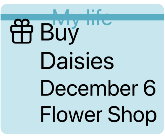
//Suddenly it clicked and it's like- okay. .background {
ZStack(alignment: .top) {
Rectangle() // this is the bright pretty teal ON BOTTOM
.opacity(0.3)
ZStack {
Rectangle() // this is the bar ON TOP 🤦♂️
.frame(maxHeight: stripeHeight)
Text("My life")
}
}
.foregroundColor(.teal)I’m kind of mad it took me this long to figure it out 😅
But I’m glad I made it past the lump. I guess I got my answer so far- No the banner does Not increase in size to accommodate the text. At least not this way 👨🍳
Updating the top property stripeHeight to have @ScaledMetric attribute did help here. So there’s that- I remember we used that in the other lesson to allow the Capsule to gain in size.

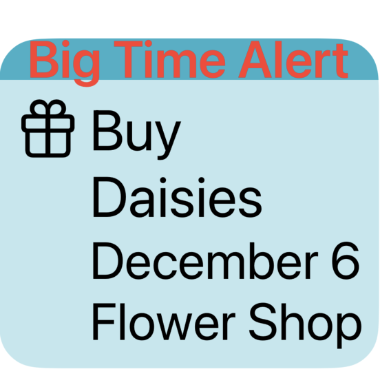
But some of you know the problem here. Design is off.

The text should be inside the ribbon
To remedy this, I increased the stripeHeight- but this is one of those problems where I feel like the product team or designer would slam me for changing that 😅 Which is fair- if we don’t have the text there everything would appear different as a result. So I want to put this idea on the shelf- how to keep the same stripeHeight & shrink the font to something manageable.
Took some time away and came back, feeling like I had a solution to the problem.
@ScaledMetric(relativeTo: .subheadline) var stripeHeight = 18.0
var body: some View {
    ...
.background {
     ZStack(alignment: .top) {
     Rectangle()     // this is the bright pretty teal
                .opacity(0.3)
     ZStack {
                Rectangle()
                Text("Big Time Alert")
                    .foregroundStyle(.red)
                    .font(.subheadline)
     }
     .frame(maxHeight: stripeHeight)
}
.foregroundColor(.teal)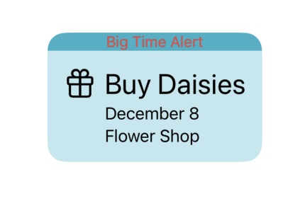

So- what’s going on?
I changed the Text(“Big Time Alert”) font to accommodate the ScaledMetric dynamic property, and I set that font to .subheadline so the actual size fits design and we can fit our text into the Rectangle better.
